Nadine
Role: Brand Designer & Creative Director
Done with: Webonise
Team members: Lead UX/UI designer Martin Cristaldo

Sitemap PLanning
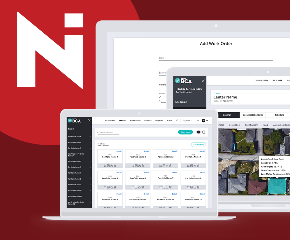
Nadine International Inc. is a consulting engineer firm that conducts Building Condition Assessments (BCA). Nadine came to Webonise with the existing software (FCAP and BCA) that organized their data in order to create reports. The app houses an immense amount of data that the Nadine engineering team gathers. That information creates the site inspection reports, and then further analysis can be applied to plan budgets for future, ongoing maintenance. This existing product needed a redesign for more visual appeal but more importantly to improve the overall user experience to better their employees’ processes. To support that, we started with documenting existing and new pages and reorganizing where needed to improve navigation.


Wireframing
At Webonise, we often start major projects like this one with a PRE phase where we work together with the client at the core requirements of a product before the full project starts. Most of these wireframes were done during that time and improved throughout the wireframe stage with feedback. We concentrated on the main organization of data since there is so much for users to manage. BCA and FCAP are very similar apps but for different users, so we often switched back and forth to ensure the slightly different structure and names were well thought through.

Designs and impact
The lead designer on this project, Martin, and I concentrated on keeping the design system we created for BCA and FCAP well defined and clear. We started working with Nadine in 2017, and we have added many features throughout our time together. Our beginning styleguide was able to stay intact even as it expanded to fit more and more functions. This product needed to be clean and clear so that the people using it each day to better do their job can do so easily - something we never forgot. We did not want that experience to only be utilitarian so we also concentrated on a simple and elegant aesthetic.
Together with our development, product management, and quality assurance teams this redesign helped decrease the overall time needed to release site inspection reports. Quality and accuracy improved because of the streamlined process established with the help of the web app. There are also a series of built-in quality assurance checks reducing the manual work of Nadine’s own QA team. The application offers a way for seamless communication between the teams to collaborate on a single project and minimize the loss of information.

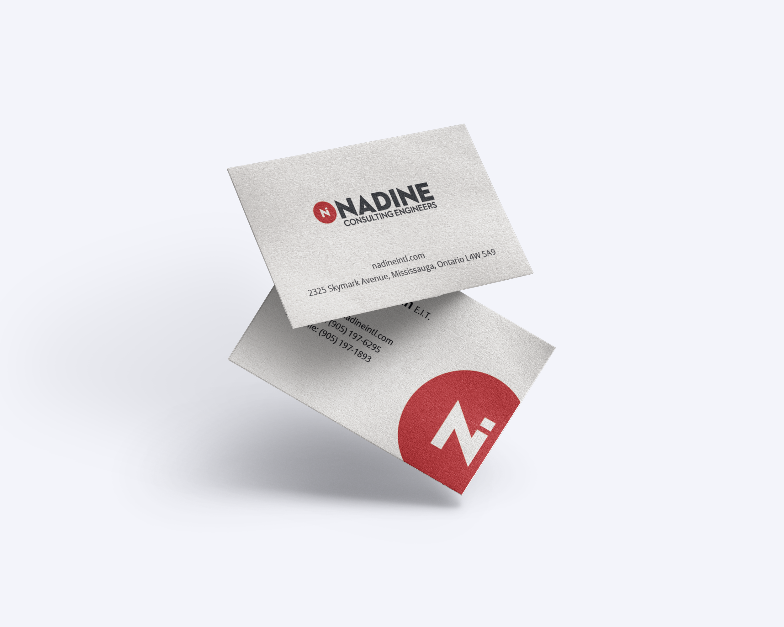
Branding
With the major upgrades to their existing software and plans for future technical improvements, Nadine needed a new identity. The new system needed to not only reflected their modern approach of their sophisticated work and software but also one that would grow with them. With the team at Webonise, I created a new identity system for Nadine’s core company as well as their software applications in order to create a cohesive branding system across their entire family of offerings.
We took this opportunity to create a distinct look that stands out in their industry as a modern face. Each logo fits into the system well, but they each are able to stand strong on their own. This system was designed to elegantly grow with them, as they approach new applications as well, like BAA and FCA.